Table Description
🔥 This feature is currently considered experimental. Try it out and give feedback by reporting bugs and suggesting new features. It’s not recommended for production use.
🛠️ This feature is available to studio makers.
This page explains how the table description can be configured in Sirius Web.
1. Introduction
TableDescription extends the shared RepresentationDescription, so tables inherit the same naming, icon, title, and domain-type conventions as other representations.
The table descriptions is organized around columns, rows, and cells.
Every setting uses the same expression editor and palette pickers you already know.
This allows you to expose hierarchical data with inline editing, contextual commands, and controllable pagination.
2. Configuring tables step by step
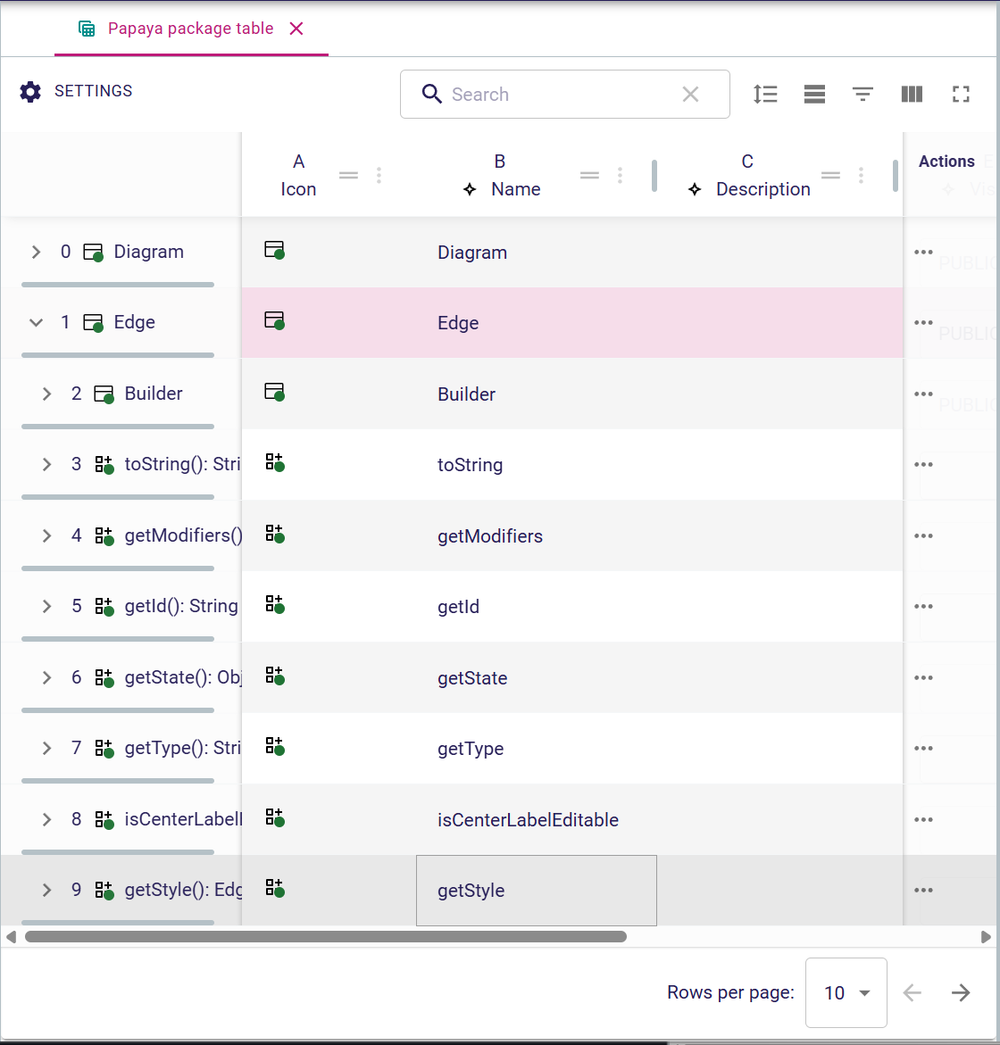
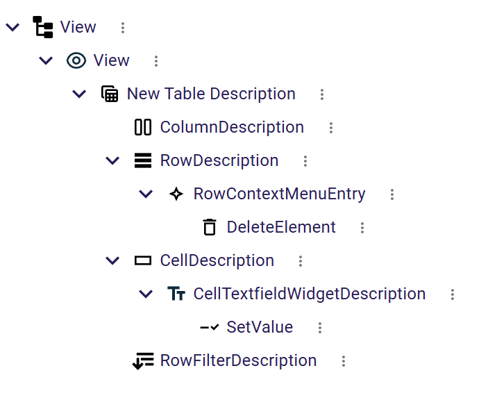
When you create a TableDescription inside your view file you will typically configure it in three stages:
-
Table-level options such as page sizes, striped rows, or row filters.
-
RowDescription to determine which semantic elements appear and how they behave (height, header, context menu, sub rows).
-
Column/Cell descriptions so each column renders the right widget and exposes inline editing where needed.
The same variables, operation language, and palette pickers used in diagrams and forms are available here, so you can reuse existing AQL expressions and Java services.
3. Table Description
3.1. Core Properties
Every representation description provides the following fundamentals:
-
name: StringA unique identifier of the description. If the name is changed, existing representations created from this description will stop working. -
domainType: DomainType Fully qualified type of the semantic element on which the representation can be created. For example
flow::Systemorecore::EClass. -
preconditionExpression: InterpretedExpression Expression evaluated on the semantic element on which the representation may be created; the representation is available only when it returns
true. If the expression is not set, the representation is always available. Here are the variables available for this expression:-
self: ObjectThe semantic element on which the representation may be created
-
-
titleExpression: InterpretedExpression Use to compute the default representation label visible when the new representation creation dialog is opened. The end user can choose not to use it and provide instead their own label. This Here are the variables available for this expression:
-
self: ObjectThe semantic element on which the representation may be created
-
-
iconExpression: InterpretedExpression Used to compute the icon associated with the representation. This expression should return an icon path, for example the path of an image file in the application like
aql:'/folder/icon.svg'for an icon available in a specific folder of a maven module.-
self: ObjectThe semantic element on which the representation is being created
-
-
description: StringSome documentation to let the studio makers understand the purpose of the representation. -
endUserDocumentation: StringSome documentation to let the end users understand the purpose of the representation.
TableDescription aggregates the global behavior of the representation.
-
useStripedRowsExpression: returns a boolean to alternate row backgrounds for readability. -
columnDescriptions: ordered containment ofColumnDescriptionelements keyed byname. -
rowDescription: singleRowDescriptionthat provides the root collection of semantic elements. -
cellDescriptions: collection ofCellDescriptionentries, each referencing a column and defining the widget rendered in that column. -
enableSubRows: boolean toggling nested rows so you can expand hierarchical data. -
rowFilters: optionalRowFilterDescriptionentries that appear above the table for quick filtering. -
pageSizeOptionsExpression: expression returning the list of page sizes (for exampleaql:[10,25,50]). -
defaultPageSizeIndexExpression: expression returning the zero-based index of the default page size among the options.
Together, these attributes determine how many rows are loaded. They also control how rows can be grouped, and which interactive controls appear in the toolbar and footer.
4. Column descriptions
ColumnDescription configures the header and behavioral aspects of a column.
-
name: unique identifier referenced by cells. -
domainType: semantic class handled by the column when it differs from the row element. -
semanticCandidatesExpression: overrides the semantic element used by the column, which is useful when the column targets a related object. -
preconditionExpression: hides the column when the condition evaluates tofalse. -
headerIndexLabelExpression: optional expression used when the header displays an index or numbering scheme. -
headerLabelExpression: main column title displayed to end users. -
headerIconExpression: optional icon shown next to the header label. -
initialWidthExpression: numeric expression defining the default width in pixels. -
isResizableExpression: expression evaluated to decide whether end users can resize the column. -
filterWidgetExpression: selects the widget type used by column-level filters (text field, select, etc.). -
isSortableExpression: expression indicating whether the runtime exposes sorting affordances for this column.
Columns act as anchors for cell descriptions. This allows multiple rows to reuse the same presentation and editing capabilities.
5. Row description
RowDescription describes how semantic elements are retrieved and how each row behaves visually.
-
name: identifier used when referencing the row description from cells. -
semanticCandidatesExpression: collection expression that retrieves every element displayed as a row. -
headerLabelExpression: optional text displayed in the row header (leftmost gutter). -
headerIconExpression: optional icon placed near the row header label. -
headerIndexLabelExpression: expression used when displaying row numbers. -
initialHeightExpression: expression controlling the default row height. -
isResizableExpression: expression allowing or forbidding manual row resizing. -
contextMenuEntries: containment list ofRowContextMenuEntryactions rendered when a user opens the context menu on a row. -
depthLevelExpression: expression evaluated per row whenenableSubRowsis true to compute the indent level of nested rows.
Rows stay synchronized with the semantic model.
When the candidate expression changes, the table updates to reflect additions, deletions, or reordered elements automatically.
When authoring the semanticCandidatesExpression remember that pagination and filtering hints are supplied through variables:
-
cursor/direction/size— provided by pagination helpers so you can load the next or previous page. -
globalFilterData— contents of the global search box. -
columnFilters— list of{ id, value }pairs entered in column headers. -
activeRowFilterIds— identifiers of row filters toggled on in the toolbar. -
expandedIds— semantic identifiers of rows currently expanded when hierarchical sub rows are enabled.
6. Cell descriptions and widgets
CellDescription binds a row, a column, and a widget so end users can view or edit data inline.
-
name: identifier used during debugging or reuse. -
preconditionExpression: governs whether the cell is rendered for a given row. -
selectedTargetObjectExpression: optional expression that remaps the semantic element targeted by operations triggered from the cell. -
valueExpression: interpreted expression that returns the value displayed or edited in the cell. -
tooltipExpression: optional expression whose result appears when hovering the cell. -
cellWidgetDescription: containment reference to aCellWidgetDescriptioninstance.
CellWidgetDescription is the shared base description implemented by the following widgets.
-
CellLabelWidgetDescription: read-only cell that displays text and an optionaliconExpression. -
CellTextfieldWidgetDescription: inline text field that can execute operations (body) when the user commits a change. -
CellTextareaWidgetDescription: multi-line editor that also exposes an operationbodyfor custom persistence logic.
The operation bodies reuse the shared operation language (ChangeContext, SetValue, CreateInstance, etc.).
Editing a cell can trigger complex semantic updates beyond simple attribute assignment.
7. Row actions and context menus
Row-level actions are modeled with RowContextMenuEntry and attached to the contextMenuEntries reference of the row description.
Each entry defines a labelExpression, an optional iconURLExpression, a preconditionExpression, and a body containing the operations to execute.
8. Styles
Table styling is primarily controlled through expressions on the TableDescription and its children.
For example, useStripedRowsExpression alternates row backgrounds.
More complex styling can be achieved by referencing TextStyleDescription from cell widgets, similar to other representations.
Row-level actions are modeled with RowContextMenuEntry.
-
name: unique identifier of the entry. -
labelExpression: text displayed in the menu. -
iconURLExpression: optional icon path shown next to the label. -
preconditionExpression: expression evaluated before rendering the entry, allowing you to hide actions on specific rows. -
body: ordered list of operations executed when the entry is selected.
9. Row filters and pagination
RowFilterDescription instances define the quick filters available above the table.
-
id: identifier used to store user preferences. -
labelExpression: label displayed next to the filter control. -
initialStateExpression: expression returning the initial enabled or disabled state.
Use multiple filter descriptions to expose facets such as status, owner, or type.
Combine them with ColumnDescription.filterWidgetExpression for per-column filtering.