Diagram
🔥 This feature is currently considered experimental. Try it out and give feedback by reporting bugs and suggesting new features. It’s not recommended for production use.
👥 This feature is available to all users.
In Sirius Web, diagrams offer an interactive and visual way to work with your models.
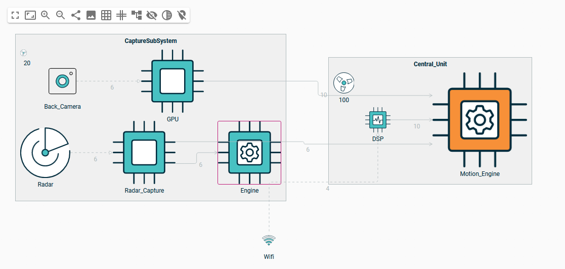
They let you create, view, and edit elements and relationships graphically, helping you understand the structure and behavior of your system at a glance. You focus on modeling; the available tools and rules are already configured for you.
1. What You Can Do
When you open a diagram, you’ll see model elements (such as components, links, containers, etc.) displayed as graphical shapes. You can:
-
Add new elements using the palette
-
Move, resize, and connect items
-
Edit labels and properties
-
Use zoom and layout controls to explore large models
-
Interact with the model in ways that are constrained by domain-specific logic
All your changes are automatically reflected in the underlying model and synchronized with other views like tables or forms.
1.1. Toolbar
The toolbar provides general actions for navigating and managing the diagram as a whole.
| Action | What it does | |
|---|---|---|

|
Full screen |
Opens the diagram in full-screen mode for distraction-free modeling. |

|
Fit to screen |
Adjusts the zoom level to ensure all elements or the current selection fit within the visible area. |

|
Zoom |
Lets you zoom in and out manually using the toolbar buttons. |

|
Share |
Generates a shareable link to the current diagram. |

|
Export SVG |
Downloads the current view of the diagram as an SVG, HTML SVG or PNG image. |

|
Snap to grid |
Helps align elements precisely by snapping them to an invisible grid during movement or resizing. |

|
Helper lines |
Displays visual guides when dragging elements to assist with alignment. |

|
Arrange all |
Automatically reorganizes all elements to improve overall layout clarity. |

|
Smart Edges |
Enables edge routing that avoids crossing nodes (experimental, client-side only, not saved). |

|
Show hidden elements |
Reveals hidden edges, nodes, or other visual components. |

|
Unfade elements |
Restores full visibility to elements that were faded. |

|
Unpin elements |
Allows previously pinned elements to be moved freely again. |

|
Filter |
Applies visual filters to focus on elements matching specific attributes or types. |

|
Manage selection |
Select or unselect elements based on their type or hierarchy on the diagram. |
You can combine Arrange All, Helper Lines, and Snap to Grid to quickly clean up complex diagrams.
|
|
|
1.2. Contextual Palette (Right-Click)
When you right-click on an element in a diagram, a contextual palette appears. It offers quick access to actions you can apply to the selected element—or to a group of elements if you’ve selected several.
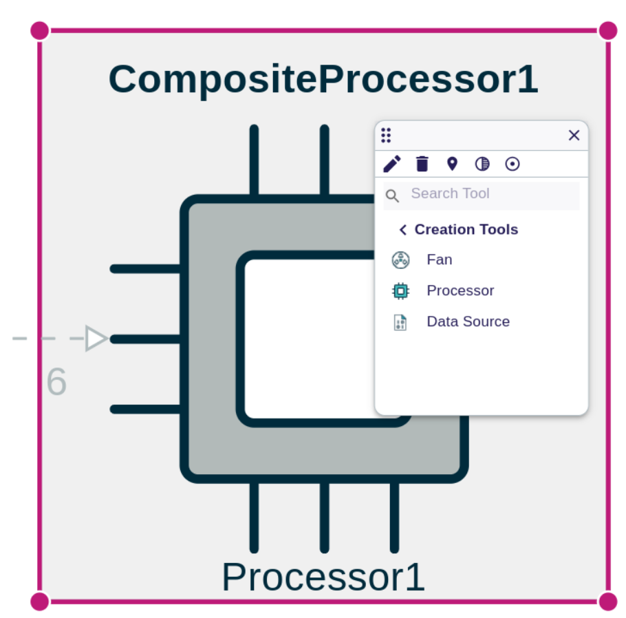
Unlike the toolbar, which offers tools for managing the entire diagram, the contextual palette adapts to your selection—showing tools specific to the selected nodes, edges, or diagram.
1.2.1. How to Use
-
Right-click on any element in the diagram (e.g., a node, an edge, or the background of the diagram itself).
-
A palette appears next to the selected element.
-
Click any of the available tools to perform the desired task.
1.2.2. Tools on single element
| Tool | What it does | |
|---|---|---|
|
Create element (Diagram) |
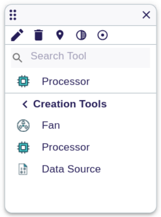
Add a new child or related element (e.g., create a sub-component). You can create new nodes from the background of the diagram by right-clicking to open the palette. Creation tools are grouped by category; expand a section, choose a tool, and then click where you want to place the element. |
|
Create element (in Element) |
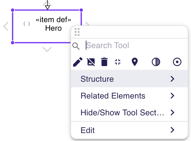
To add elements inside an existing node, right-click the parent element and select the appropriate creation tool. |
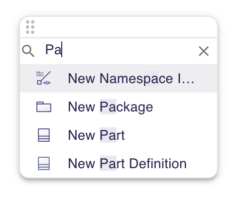
|
Search field |
The palette’s search field helps you filter tools across every section when a representation defines numerous element types. |

|
Create an edge |
Add a new child or related element (e.g., create a connection). |

|
Delete from model |
Remove the selected element from both the diagram and the semantic model. |

|
Delete from diagram |
Remove the selected element from the graphical view. |

|
Collapse |
Hide all the child nodes of the selected node. |

|
Edit |
Lets you rename the element or change its properties directly in the diagram. |

|
Hide |
Temporarily removes the element from the diagram. You can show it again later using the toolbar. |

|
Fade |
Makes the element appear dimmed so it’s less distracting, without hiding it completely. |

|
Pin |
Locks the element in place so it doesn’t move when rearranging the diagram. |
|
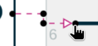
Reconnect |
Change the source or target of an edge. |

|
Adjust size |
Automatically resizes the element to fit its content. |
|
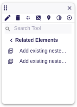
Custom tools |
Domain-specific actions that appear when the current domain provides them (for example: Mark as Deprecated, Duplicate, etc.). |
|
The tools available in the contextual palette vary with the domain and representation description. |
|
You can also use keyboard shortcuts or the details panel to perform some actions. |
|
A confirmation dialog appears when you delete from the model, unless you disable it in the dialog itself. 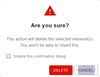
|
|
The confirmation preference is stored in your browser’s local storage. Clear the Sirius Web data in the cache to restore the dialog. |
1.2.3. Tools on Multiple Elements
When you select multiple elements (e.g., by holding Shift and dragging a selection box), the palette shows other tools including some for organizing and aligning the selection.
|
To select multiple elements:
When a rectangular selection starts on a node, that node and its containers are excluded from the selection. Start the selection outside nodes to include containers. |
|
When selecting multiple elements, you can observe that the last selected element is highlighted with a different angle-handle color. Most of the layout tools are relative to this last selected element. |
| Tool | What it does | |
|---|---|---|
|
|
Pin / Unpin |
Pins all selected nodes so they stay in place when the diagram is rearranged. When all selected nodes are already pinned, the tool becomes Unpin and unpins them. |

|
Align horizontally |
Aligns selected elements horizontally to the left, center or right, relative to the last selected element. |

|
Align vertically |
Aligns selected elements vertically to the top, middle or bottom, relative to the last selected element. |

|
Distribute |
Evenly spaces selected elements horizontally or vertically. |

|
Arrange |
Automatically reorganizes selected elements for a clearer layout, such as a row, column, or grid. |

|
Justify |
Adjusts the positions of selected elements to fill available horizontal or vertical space. |

|
Make same size |
Sets all selected elements to have the same width and/or height as the last selected one. |
1.3. Alignment helpers and auto-sizing
The toolbar offers visual aids for precise positioning:
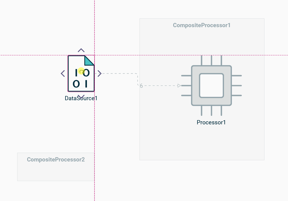
When helper lines are enabled, guides appear as you drag a node so you can align borders or centers perfectly. Nodes snap to these guides automatically:
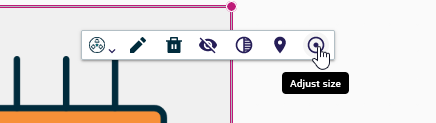
Use the Adjust size tool in the contextual palette to shrink a node back to its minimal footprint if manual resizing made it too large:
1.4. Edge creation
Edges can be created directly from the diagram surface:
-
Click on a node to reveal the connection handles around its border, then drag a handle toward a target element.
-
Release the mouse over a valid target to finish the edge.
If no edge can be created to the given target, the corresponding node appears faded, which helps you avoid invalid edits. When you start the creation gesture, click the source element to display the handles, then drag from the appropriate arrow toward the target.
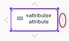
While you drag, the diagram draws a preview of the edge and highlights valid targets.
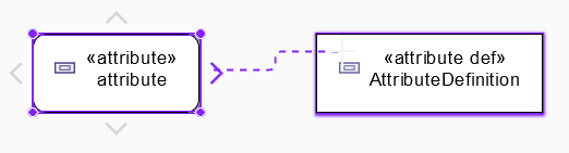
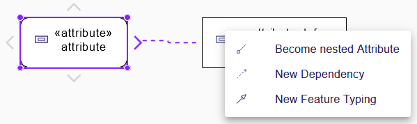
After you release the mouse button, a pop-up lists the compatible relationship types whenever more than one edge can be created between the selected target. If only one type fits, the edge is created immediately without displaying the dialog.
You can reconnect an existing edge by grabbing its source or target handle and dropping it on a new node. Invalid reconnection targets are faded just like during creation. Relationship edges are always synchronized with their semantic counterparts, so deleting them from a diagram also deletes them from the model. To delete a relationship from the model, select the edge and use the delete command.
1.5. Editable edge paths
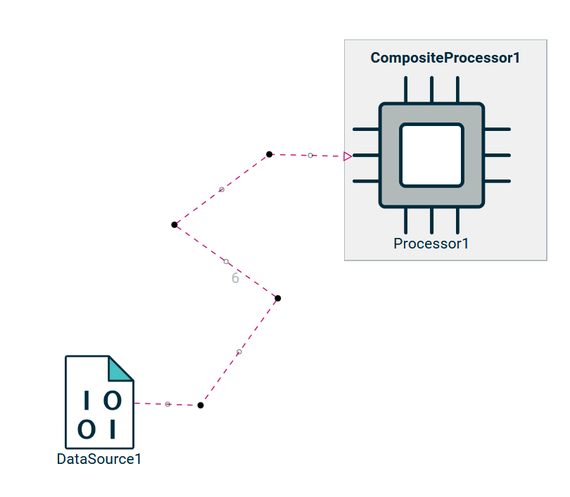
Edges expose handles so you can fine-tune their routing:
-
Drag the black handles to move existing segments.
-
Drag the gray midpoints to insert a new bendpoint.
-
Double-click on a bendpoint to remove it.
-
image::representations/editable-edge-reset-tool.png[Reset edge path] Use the palette action to restore the original path when needed:
2. Drag and drop
Diagrams support semantic drag-and-drop: select elements in the Explorer View and drop them on the diagram background to reveal them without altering the semantic model. Dropping elements directly into target nodes lets you quickly display the relevant views.
Graphical drag-and-drop works entirely within the diagram. Drag a node over another node or the background of the diagram to move it; eligible targets remain visible while forbidden ones fade out. As you hover over a valid target, it is highlighted to confirm the drop location.
3. When to Use It
Use the diagram representation when:
-
You want to visualize the structure or composition of a system.
-
You prefer a graphical layout to better understand relationships between elements.
-
You need to create or edit models in a spatial, drag-and-drop interface.
-
You’re working on system design, architecture, workflows, or any visual representation of domain logic.
4. Example
In a system modeling context, a diagram might show:
-
Components and their relationships (e.g., a
Sensor,Controller, andActuator) -
Nested structures like subsystems or containers
-
Connections such as communication links or data flows
-
Visual cues based on domain rules (e.g., a red border around components with missing links)
This visual approach helps engineers and domain experts understand the system at a glance and make informed modeling decisions quickly.
|
The layout and available elements in the diagram depend on how the modeling environment has been configured. |